Category ArchiveUser Interface
Illustration &User Interface SpinMeister on 21 Nov 2015
Designing a New Logo for Leica Geosystems Cyclone
[Originally written in 2015, this post has been updated Feb. 28, 2022. Obviously, the logo artwork is no longer “new” and I have no knowledge whether or not it is presently in use. – HG]
In the beginning, there was the 32 x 32 Cyclone 7 icon, the only logo artwork available. This image had been used for a number of generations of Leica Geosystems’ 3D point cloud processing software, Cyclone. With the launch of Cyclone version 8, it was high time for a new look, and new logo to accompany the powerful new 3D software update. So began the search for a new look, a refreshed identity embodied in a graphical symbol, a new logo.
My first inclination was to explore completely new concepts and looks, showing that Cyclone’s connection to the 3D world and playing off of the cyclone, tornado, whirlwind concept.
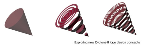


Using Autodesk Maya and Adobe Illustrator, I tinkered with a conical theme, keeping in mind that Cyclone’s letter “C” might be worked into it.
Not being completely sold on the cones, it was time to revisit the original icon, and break down what it was about. Outlining the artwork in Illustrator, it became clear that the logo was a pair of letter “C”s with a red dot, viewed in 3D perspective. I decided to try and recreate this using a 3D camera view in Maya.
Here we see two C’s extruded, with a cylindrical dot placed in the center. Getting on the right track for 3D software now! More refinement to be done.
Here a slight rounded bevel has been added to the extrusion, and textures to the 3D geometry. Time to explore more surface treatments, lighting and rendering.
The rendering on the left has a few more directional lights added to the Maya screen preceding it. The rendering on the right is the result of adding a brushed metal, stainless steel style texture and bump map to the rendering. The camera was changed to a wider angle lens setting, to force a more oblique, dynamic perspective, closely matching the original Cyclone 7 logo. The next test would be to composite the new logo into the Cyclone 8.0 splash screen.
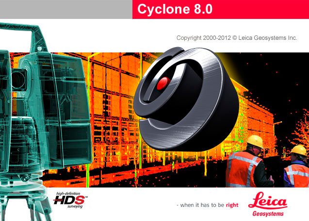
With this, the small product management group felt we had a winner, and were anxious to release the new software. Upon further review, we had not yet scored a goal, and so gave it another shot along with helpful suggestions. The final logo is brighter and easier to read and interpret, and still holds true to the 3D software roots of Cyclone. The new logo was launched proudly with Cyclone 8.
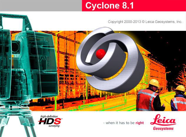
The logo design lives on in the current Cyclone version 9.1. The style has been adopted for branding Leica’s CloudWorx for AutoCAD software, and the JetStream high point cloud rendering system.

Media &User Interface SpinMeister on 29 Nov 2012
Contemplations on a Website Redesign
Mediaspin.com, my very first website, has undergone very little change or update over the past 4 or 5 years. It’s been online since 1996, and the home page has changed very little. Media Spin Interactive, Inc. was dissolved in 2002, and since then the site became a kind of archive of various work in illustration, animation, photography, and blogging. In order to build a new portfolio of my work, it was easier to create a clean, new website, ahgdesign.com and populate it with specific content on a limited number of pages, than to overhaul the mediaspin.com site.
Design concepts have been sketched out, but nothing has stuck as worthy of the effort. The idea of a Flash animation, randomly spinning content and media appeals to me, but it would be sad to not have it appear on non-Flash platforms. I want to be original, so website templates seem to be too stylish, slick and overly commercial for my taste. The plan is to preserve many of the current pages and URL addresses, because hundreds of links and citations have been made over the years, and would not want to break them.
A modified WordPress template or Squarespace might work as a pathway to a website update. I have to research the impact of these a bit further, and most of all put in the sweat involved.
User Interface SpinMeister on 14 Sep 2011
Jonathan Ive and Design Inevitability

A recent SF Chronicle/Bloomberg article highlighted the work of Apple senior VP of industrial design, Jonathan Ive. He oversaw the development of the early candy-colored iMacs, the miniature G4 Cube computer, the iPod, iPhone and iPad. Pretty impressive accomplishments!
The article features a quote that I want to hold onto, about his design goal,
“is not self-expression. It’s to make something that looks like it wasn’t really designed at all – because it’s inevitable.”
This brings to mind the idea of a piece of marble or wood, that due to its unique qualities, has a predesitined sculpture embedded inside, awaiting the creative designer to chisel and conjure it out. The new UI challenge is to apply this to new forms of nature, such as mountains and streams of information and data.
User Interface SpinMeister on 09 Jun 2011
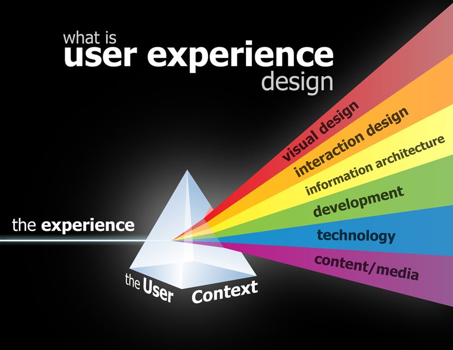
UX Diagrams
In User Experience development, it is a good idea to take a step back from time to time to assure yourself and the team that you are on the right path. These UX process diagrams provide food for thought, from professionals in the field.
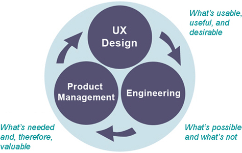

User Experience Sundial

Mobile &Projects &Technology &User Interface SpinMeister on 23 Jan 2011
Sony releases Android Reader app

Sony releases Reader app for Android 2.2. There appears to be a demand for other versions, as in this blog post from the Sony eReader Journal. I’m working on a similar app for other platforms.
Internet &Projects &User Interface SpinMeister on 24 Jul 2010
Launching the new Career Element

Exciting times ahead for CareerElement, a website I took an active role in the visual design and product development beginning April 2009. They will be hosting their first high-tech career fair Tuesday, August 17, 2010, 4:30pm at the Stanford Park Hotel 100 El Camino Real, Menlo Park, CA.
CareerElement is led by CEO Paul Campbell a UC Berkeley Engineering graduate, and finishing his Masters at Stanford. He assembled a strong team of software engineers who required User Experience and visual design help from Gregg Boot of west11.com design firm and me.
As part of the design team we had to start from scratch, brainstorming the name and identity of their new job hunting, social networking website, flow charting and wire framing the layout of the entire site.
There is much more in the works at CareerElement, so stay tuned and sign up for the career fair to learn more.
Update: CareerElement has temporarily gone offline for a redesigned, improved business direction.
General &Projects &User Interface SpinMeister on 02 Jan 2010
Online Training in Case of Emergencies

A recent web-based training project in After Effects produced by Splitvision Digital required adding visuals to narrated coursework scripts for NACCHO (National Association of County & City Health Officials).
The project included many detailed modules and important text information for training and co-ordinating public health emergency teams to respond with organized readiness. The idea is to enhance and compliment the text and narration with interesting photos, graphics and animation without distracting or biasing the intended course material to be communicated and learned by those using the online training.
Coincidentally, or not, the contract I took on following this, was an even larger instructional design project for PG&E Academy, produced by The Mosaic Company. Flash is the common denominator in both projects. Splitvision compressed the AE movies to load into a Flash interface, and PG&E uses PowerPoint plug-ins to extend its features and export to a Flash end product.
See a sampling of the training videos here.
Internet &User Interface SpinMeister on 28 Aug 2007
Slide Traction
![]() VentureBeat‘s article points out that Slide is contributing to the addition of one million new Flash widgets daily across all non-Facebook social networks, such as Myspace. Facebook is listed on the Slide web site, so I’m not sure what the distinction is that VentureBeat is making.
VentureBeat‘s article points out that Slide is contributing to the addition of one million new Flash widgets daily across all non-Facebook social networks, such as Myspace. Facebook is listed on the Slide web site, so I’m not sure what the distinction is that VentureBeat is making.
So what’s the big deal? Slide has created templates of clever skins and image processing tricks to enable non-Flash programmers to build slide shows and customized animations using their own digital images. You can take a Flickr photo or a YouTube video and jazz it up your way. Personalization is a big deal in the world of social hobnobbery.
